
Designing a photo book is an exciting process — hours are spent choosing images, refining layouts, and crafting something meaningful. At Studio22, our support team reviews a wide range of photo book orders every week, and while most are beautifully designed, there are a few common layout issues we see come up repeatedly.
These are not technical errors — they are design considerations, and understanding them early can help ensure that the book you design is exactly the book you receive.
One of the most important (and most misunderstood) concepts in photo book design is the gutter.
What is the gutter in a photo book?
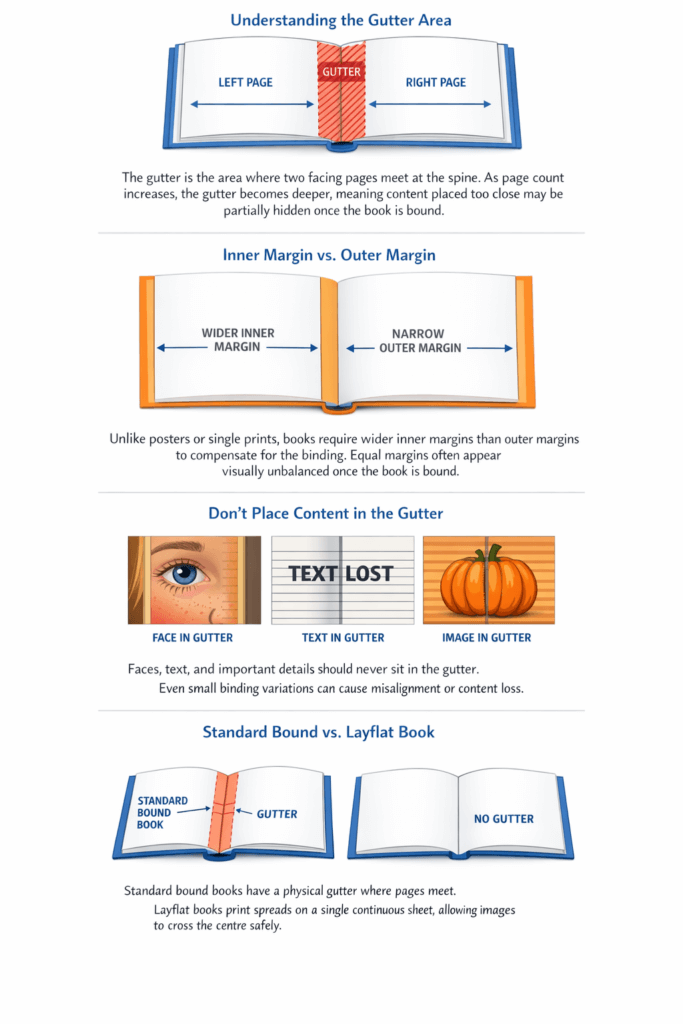
The gutter refers to the area where two opposing pages meet at the spine of the book — essentially, the binding area. This is the part of the page that curves inward when the book is closed or partially open.
As a general rule:
The thicker the book (the more pages it has), the deeper the gutter becomes.
Because of this, any important content placed too close to the gutter risks being partially hidden, visually distorted, or misaligned once the book is bound.
1. Placing faces too close to the gutter
Spanning a photo across two pages can look striking — but it needs to be done carefully.
In standard hardcover photo books, each page is printed on a separate sheet. When a face falls near the gutter, even a very small shift during binding can result in misalignment. The result may be subtle, but it can be visually uncomfortable — especially with eyes, mouths, or facial symmetry.
For this reason, we strongly recommend keeping faces well clear of the gutter in standard bound books.
Layflat photo books are the exception.
Because layflat spreads are printed on a single continuous sheet and open flat, there is no central gutter swallowing content. These books are ideal for full-spread images where faces or key details cross the centre.
2. Allowing text to sit in the gutter area
Text is particularly vulnerable near the gutter.
When text is placed too close to the binding:
- Portions can disappear into the spine
- Words may become difficult or impossible to read
- The meaning of a sentence can change entirely
If you want text to visually span a two-page spread, the safest approach is to place separate text boxes on each page, align them carefully, and keep the text comfortably away from the gutter.
Even a few extra millimetres of space can make a significant difference.
Again, while layflat books reduce this risk, thoughtful spacing is still part of good design practice.
3. Letting image stickers cross the gutter
Decorative elements like stickers, overlays, and embellishments add personality to a book — but they also need careful placement.
If the centre of a sticker sits in the gutter, there’s a real risk that:
- The middle portion disappears into the binding
- The two halves don’t align perfectly once bound
As a general guideline:
- Decorative overlays and textures often tolerate the gutter well
- Recognisable objects (animals, people, icons, shapes) should be kept out of the gutter
Allowing a sticker to slightly overlap onto the next page is usually fine — just avoid placing critical detail directly in the binding area.
Why wider inner margins matter
Many designers instinctively leave equal margins on all sides — but in books, this often isn’t ideal.
Because of the binding:
- Inner margins typically need to be wider than outer margins
- This helps maintain visual balance and readability
- It ensures important content doesn’t feel “pulled” into the spine
There is no single correct measurement for this. Margin and gutter decisions depend on:
- Page count
- Binding type
- Image placement
- Visual intent
This is why margins are taught as part of design and layout, not as fixed technical settings.
Studio22’s role in the process
Our role is to print and bind your book as accurately as possible based on the files supplied. We provide software guides, safe-zone indicators, and technical recommendations — but we don’t redesign layouts or override creative decisions.
Allowing generous inner spacing is not a mistake — it’s often a sign of thoughtful, professional design.
When in doubt, leave more space, not less.
If you’re unsure how a layout will behave once bound, we’re always happy to explain the technical behaviour of the book — how it opens, where the gutter sits, and what to expect physically — so you can make informed design choices with confidence.